Styles and Colors
You can personalize the widget using a configurable color palette:
- Primary button and accent colors
- Text and icon color settings
The default palette follows accessibility and clarity standards, but you can fully override it to match your design system.
To apply your style settings:
- Log into the Saphere Ops then Scan Customization.
- Create a new customization
- Choose your colors.
- Save and retrieve your
customizationId.
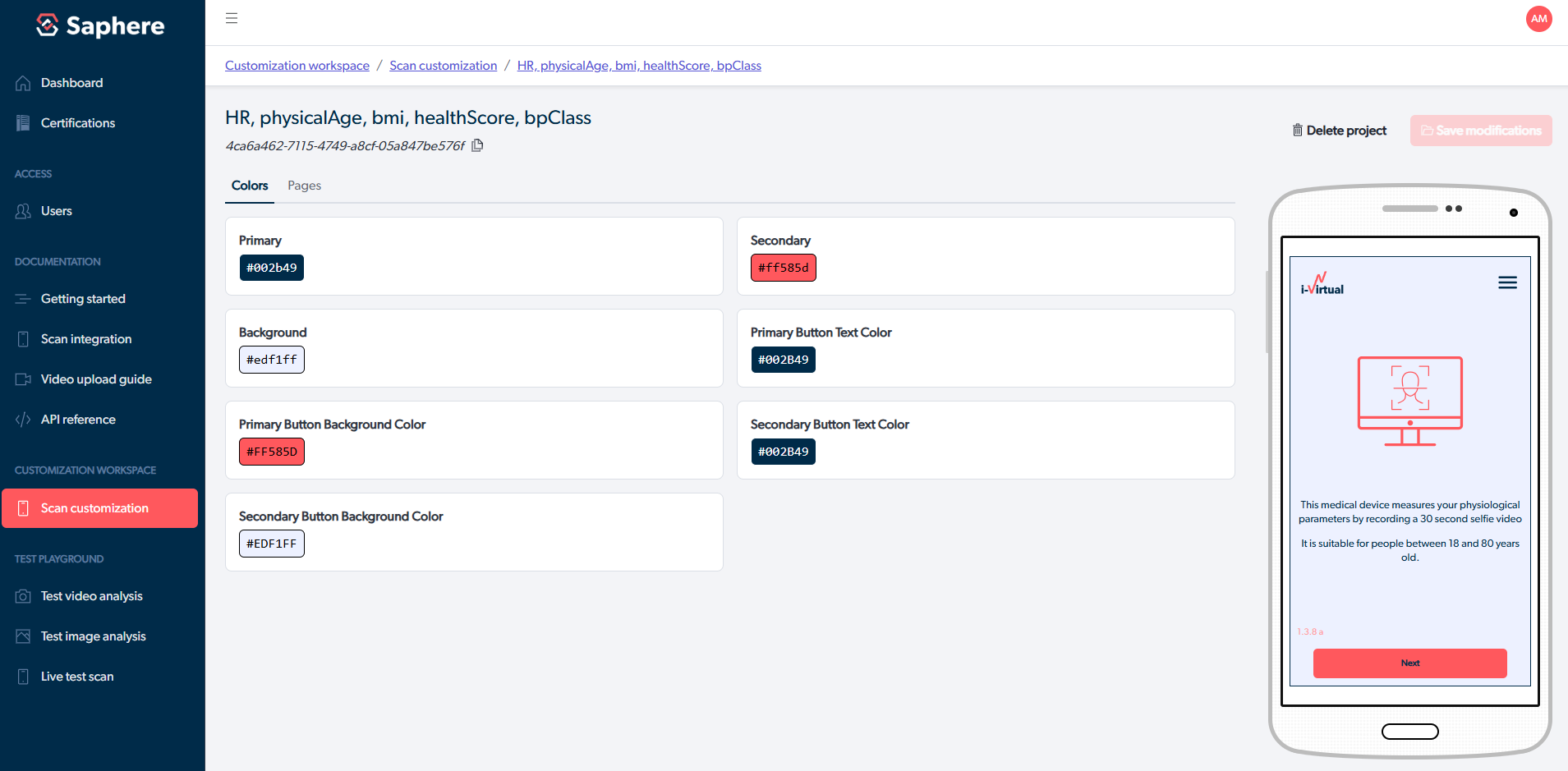
This ID applies your style theme automatically when the widget loads.